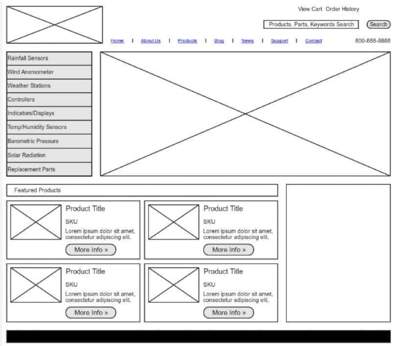
Let’s cut to the chase: if your website isn’t built for mobile-first users, you’re losing business — every single day.
More than 65% of website traffic comes from smartphones and tablets. Yet, many small businesses still treat mobile optimization like an afterthought.
Here’s why mobile-first design isn’t just a “nice-to-have” — it’s a must.
What Is Mobile-First Web Design?
Mobile-first design means your website is designed from the ground up for mobile devices, then scaled up for desktop — not the other way around.
This ensures:
- Fast load times
- Easy tap targets
- No pinching, zooming, or sideways scrolling
- A seamless experience on all screen sizes
It’s not about making your desktop site shrink.
It’s about designing with mobile users as the priority.
Why It Matters More Than Ever
🧠 1. Google Indexes Mobile Versions First
Google switched to mobile-first indexing, which means it ranks you based on your mobile site, not your desktop one.
If your mobile version is broken, slow, or incomplete — you’re punished in rankings.
🛍️ 2. Mobile Visitors Are Buyers
More users are shopping, booking services, and making decisions from their phones.
They expect speed, simplicity, and clarity.
💡 A one-second delay in mobile load time can decrease conversions by up to 20%.
🚫 3. Bad Mobile Sites Create Instant Bounce
Ever visited a site where:
- Buttons were too small?
- Images didn’t load?
- Text was unreadable on your phone?
Most users leave immediately — and they don’t come back.
Signs Your Site Isn’t Mobile-First (But Should Be)
- ❌ The desktop version shrinks awkwardly on your phone
- ❌ Buttons are too close together
- ❌ Menus are confusing or cluttered
- ❌ Page takes more than 3 seconds to load
- ❌ You have to scroll sideways to read anything
If you checked even one of those… it’s time for a redesign.
What a Mobile-First Site Should Look Like
✅ Large, clear buttons
✅ Sticky nav bar for easy access
✅ Optimized image compression for fast load times
✅ Tap-to-call and tap-to-scroll features
✅ Prioritized content (above the fold = most important)
What About Tablets and Desktop?
Good news:
Mobile-first doesn’t mean mobile-only.
When built right, your website will scale beautifully across all screen sizes — from a 6.1″ iPhone to a 27″ iMac.
That’s what WebBrandSEO delivers.
You Can’t Afford to Be “Mobile-Friendly” — You Need to Be Mobile-First
In today’s world, your mobile site is your website.
Don’t lose customers because your site wasn’t built for how they actually browse.

